
Beautiful Statistics, Messy Politics
Posted: February 7, 2014 Filed under: Creative, Unusual, Amusing, Measurement and Analytics | Tags: data visualization, graphical analysis, graphics, information visualization, Renzo Lucioni, U.S. Congress Leave a commentRenzo Lucioni, who describes himself as “a Harvard senior who enjoys solving problems and organizing information. I’m interested in using information visualization to make complex data accessible, useful, and even fun” did some cool analytics and an even cooler graphic to bring the data to life (http://renzolucioni.com/articles/senate-voting-relationships/):
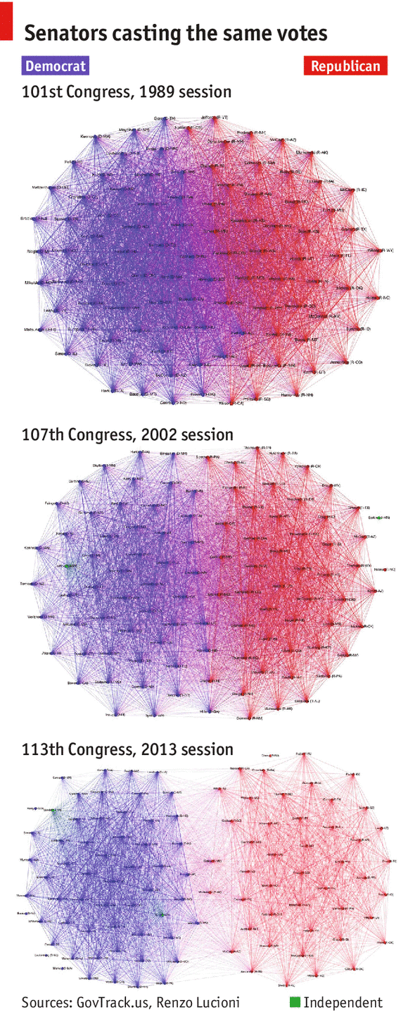
Using voting data from the 101st Congress through the current 113th Congress, I created a series of network visualizations showing voting relationships between senators.
I made the graphs using Gephi, roll call data from GovTrack, and this Python code. In each graph, edge (u, v) is assigned weight equal to the number of times Senator u and Senator v voted the same way, either Yea or Nay. For the sake of clarity, I filtered out edges with weight less than 100; these lighter edges generally indicate agreement on procedural votes.
The clusters you see in each graph are the result of using Gephi’s Force Atlas layout, which applies a force-directed algorithm to the graph and causes those nodes connected by heavier edges to be pulled together more tightly. A nice side-effect of using this physics-based model is that more bipartisan senators are pushed closer to the center of the graph, near the party divide, while less bipartisan senators are repelled outwards toward the perimeter of the graph, furthest from the party divide.
The Economist wrote of the analysis and graphic:
About 25 years ago, American policymaking looked like a tightly bound ball with lots of meshing in the middle, as senators regularly crossed the aisle to get things done. Over time the two sides have split apart, like an amoeba dividing, separating into distinct spheres that share little common voting. When the chart was produced in late November by Renzo Lucioni, a computer-science undergraduate at Harvard University, it went viral in the blogosphere. Though America’s political polarisation has become a fact of life, it has never been seen so graphically: as a diseased brain, with few neural pathways between the two hemispheres.
