
The Chart that Saved Lives
Posted: January 26, 2014 Filed under: Measurement and Analytics | Tags: 1964 Report on Smoking and Health, analysis, Black Belts, Cigarette smoking, effects of tobacco, Lean Six Sigma, log scale, Luther Terry, regression, Smoking and Health, U.S. Surgeon-General Leave a comment
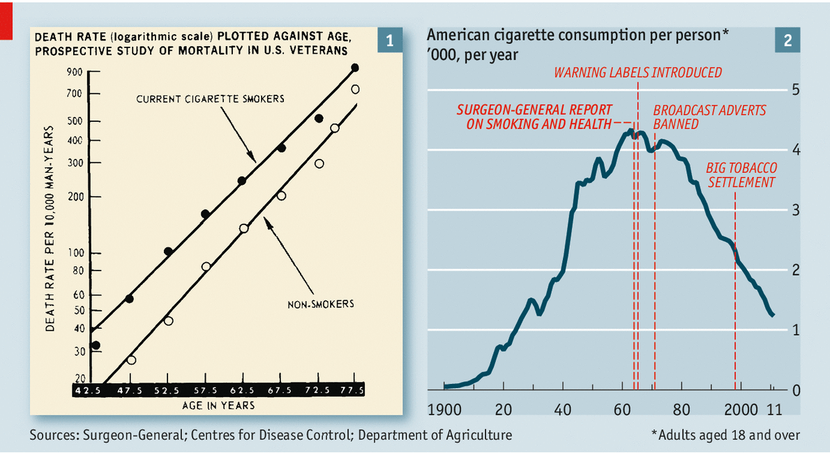
Fifty years ago this month — January 11th, 1964 — the U.S. Surgeon-General Luther Terry released a 400-page document titled “Smoking and Health”. A team of 10 scientists had analysed 7,000 studies to assess the effects of tobacco on the human body. “Cigarette smoking is causally related to lung cancer in men. The data for women, point in the same direction.”
The report clearly showed how smokers died younger. A year later, Congress required health warnings on every packet. Public understanding of the risks of smoking changed even faster. Ads in the 1950s had claimed that tobacco was good for you; after the report millions of Americans quit puffing. In the past 50 years cigarette consumption per adult has fallen by 72%.
Although the report was filled with tables, charts and text, the “killer chart” below left did what every great graphical display of information does: it provides a clear and concise grasp of a single, important point. Note also the use of the log scale for the vertical axis, something many Lean Six Sigma Black Belts and managers do not do (or do not know how to do). Its use greatly enhances the interpretation of the data.
Source: The Economist

U.S. Surgeon General Luther Terry addressing press conference at the release of the 1964 Report on Smoking and Health
