
Cool Logos
Posted: January 10, 2013 Filed under: Creative, Unusual, Amusing | Tags: award winning design, branding, communication, logos, marketing Leave a commentA “cool logo” (which is admittedly in the eye of the beholder) is one of those things that is hard to define other than when people instantly are drawn to, understand, and are engaged by a graphic. Each of us has examples of logos that we respond to for a variety of reasons. In previous posts we looked at some of the famous creators of images, such as Saul Bass or the firm Sid Lee, as well as lesser-known brands such as Frank (the hot dog purveyors).
Here are a few other lesser-known logos or trademarks that caught my eye:
These images are the work of a firm called BradfordLawton (http://www.bradfordlawton.com/index.html); they are simple, witty and yet convey the essentials about the business or organization:

“Wine to Water is a non-profit organization that organizes wine tastings to raise money to build water systems”
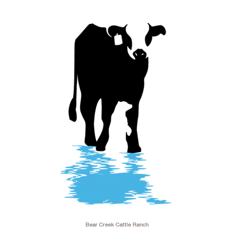
“The ranchers at Bear Creek Cattle Ranch take pride in their Hereford cattle, a breed of cow that is distinguished by distinct markings and hardiness. For the logo, we incorporated not only an illustration of this stellar breed of cattle, but also a subtle silhouette of the animal for which the ranch is named.”

“Hemby Construction is a locally based construction company founded by Jim Hemby”

“The simple and elegant environments of this high-end chain of hair salons provided us with the clues we needed to create a new logo for their corporate identity. By simply utilizing the unique portion of a hair stylist’s scissors to form the M in the owner’s name, this award-winning design states clearly who they are and what they do.”
